Start learning today!
Get early access to learning opportunities from Journalism Courses by the Knight Center.
Students from the United States to Australia, from Colombia to Spain and from Brazil to Angola have taken part in the Knight Center’s first Massive Open Online Course (MOOC) offered simultaneously in English, Spanish and Portuguese.
“Data Journalism and Visualization with Free Tools,” offered in association with Google News Initiative, attracted 12,785 people from 160 countries and was taught by a team of nine experts in the field.

Journalism class at Universidad Laica Vicente Ricafuerte taking the data journalism and visualization MOOC from the Knight Center. (Photo: Gisela Raymond)
“We were stunned at the enthusiasm for the course. It was so inspiring to see students from all over the world dive into the world of data journalism and show how important the field has become - and the demand for more training around innovative new practices,” said Simon Rogers, data editor on the News Lab team at Google and one of the lead course instructors.
For six weeks, Rogers and lead instructor Alberto Cairo, Knight Chair in Visual Journalism at the University of Miami, led a team that took students through “the entire pipeline of producing a data story,” as Rogers explained.
The other instructors were Marco Túlio Pires (Google), Minhaz Kazi (Google), Dale Markowitz (Google Cloud), Debra Anderson (Datavized), Duncan Clark (Flourish/Kiln), Jan Diehm (The Pudding) and Katherine Riley (Flourish).
Gisela Raymond, professor of investigative journalism at Universidad Laica Vicente Ricafuerte in Guayaquil, Ecuador, integrated the course as part of the material for her class of students who are in their final year of school.
“I am a journalist who covers economics and have worked with data for a long time as the basis of my publications,” Raymond told the Knight Center. “That is why I motivate young people to stay up-to-date, especially with the advantages that technology offers us.”
In Belo Horizonte, Brazil, journalist Mike Faria took the course to learn how to handle, examine and transform data into content that is easier for the general public to understand.
“I enrolled in this course because I realize that data journalism is an area within journalism that is being very much demanded by professionals in the field, besides lately generating complete stories that can attract attention and attract the public, as well as combine many information and formats into one article,” he told the Knight Center. “Moreover, it is a field that is very promising in journalism today, considering that much of the facts are contained in the data and knowing how to turn these points and numbers into visualizations is very important in this context, especially with free tools.”
As part of the course, students were asked to create a data journalism project and share it in the discussion forums. Although the course ended in late November, the Knight Center is keeping it open until the end of the year so that students can continue to access the materials and post links to their projects.
Faria used the program Flourish to examine the proportion of women and men working in journalism in Brazil.
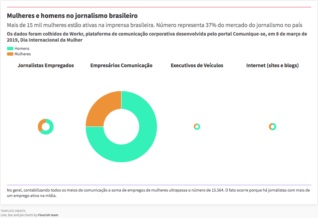
For Mike Faria’s final project, he looked at the proportion of women and men in Brazilian journalism. (Screenshot)
“I chose the theme for the final project out of my curiosity and concern to investigate the gender distribution in the field of journalism, given the wide discussion, especially today, of women's active participation in the labor market, but also the still present imbalance in relation to men,” Faria explained, adding that he did the visualization using Flourish, one of the free tools taught during the course.
Lead instructor Alberto Cairo has been keeping an eye on the final projects shared by students.
“I was impressed by the variety of topics and approaches, and I hope to see many more projects by the end of this year, as students have until December 31st to submit their work if they want to apply for a certificate,” he told the Knight Center. “It’s encouraging to see so many people from all over the world wanting to learn data journalism and also visualization!”
For his final project, student Shriram Sharma, a former tech and data journalist on a study break, also chose something related to journalism. He used animated bar charts for a time-series analysis of the best and worst countries in terms of press freedom.
“I think press freedom serves as a check against power and abuse of power. Our world has been gradually slipping into authoritarianism in the past decade,” said Sharma, who is from India. “This is something that, we as a community of journalists, intuitively feel, but it's great to have data to validate it (even if the data hasn't been updated since 2017.)”
He was also inspired by the course to experiment with scrollytelling, an interactive way to bring readers through a story online.
“We are thrilled with the success of this course and the reach that it had,” said Mallary Tenore, associate director of the Knight Center. “It’s clear from reading students’ comments in the discussion forums and seeing their final projects that they got a lot out of the course and that it had an impact on their work. We hope the materials from the course will continue to be an ongoing, free resource for journalists around the world.”
Course resource pages will be available in each language during the new year.